

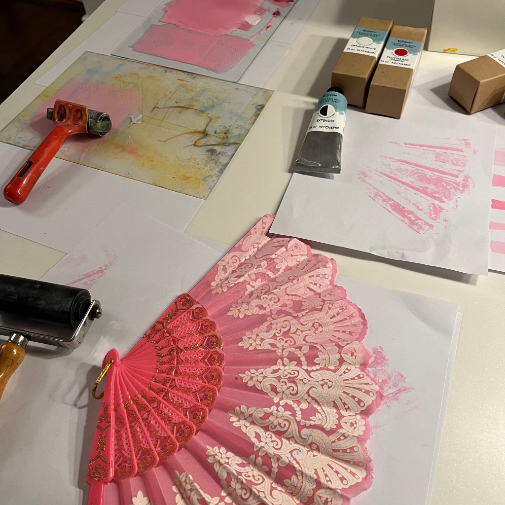
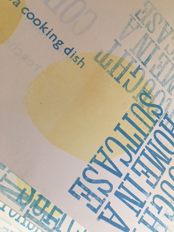
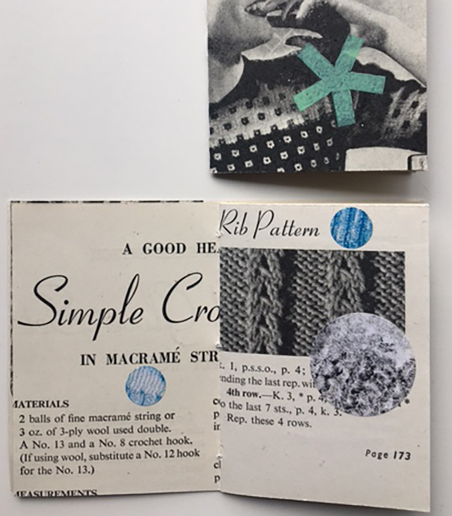
P: work began by examining the seven individual double page spreads and initially identifying numeric values within each with which to work; in addition, shapes and letterforms were considered as potential starting points. Having trialled a series of typewriter patterns, work began on each pair of pages – working randomly the patterns were applied, however the process was unstructured, and the results lacked coherence. Work was halted and the pages reviewed again to allow a simpler approach to be acquired. The existing elements on each page would be either framed (using the +++ symbol) or deleted using repeated xxx marks.
T: Thinking about the what and where of adding new pattern began by looking at each of the seven sheets in turn. Pairs were collated and repeated elements considered as a first starting point. Having already determined to work in blue, and unsure of how to continue, I returned to looking and noticed elements of blue which could offer ideas to inform my additions. In this way typewritten shapes and letters were selected to echo those already on each sheet to extend existing ideas.
A short break from Facetime discussions enabled time to reflect on recently completed editions, and to consider future projects.
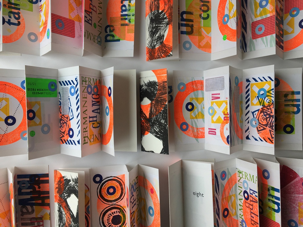
Eight – the next stage: New conversations began by considering the remaining 14 pages from Plot that had been re-worked as part of Eight. A new approach was required, and a decision made to work using opposing methodology; this edition would be led by structure rather than content. Reviewing previous works led to the proposal of a simple one-sheet book. Having divided the pages, the intention would be to work individually and respond to each page by adding pattern-based design using a typewriter (blue ribbon only). On completion the work will be exchanged and reviewed before adding some form of further pattern.
Pairing Patterns: A proposal for the upcoming BABE fair in Bristol will consider a pattern-based book using objects that connect us; discussions were formed around fabric books / stitch / printing from objects / tracing / simple structures / prints or postcards / the blue book. Research required to explore theme.
Plot – remake: A curve-ball from T, to consider remaking Plot. The suggestion was to disregard any previous research and to start the project afresh with no preconceived ideas. Research required to explore the initial theme in relation to our individual gardens.
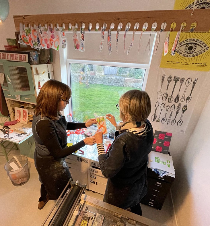
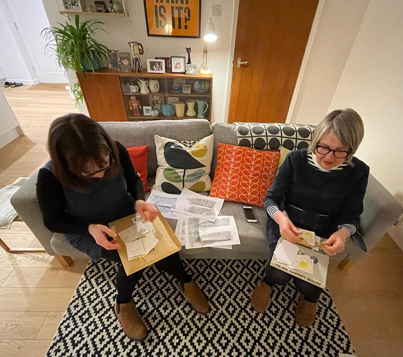
Following the making day, all three projects required further work for completion.
Project 1. Eight. The re-worked pages required cutting in half, odd page numbers –vertically, even pages horizontally; the placement was defined by selecting numbers from a ‘hat’ to provide the order. In addition, a system of rotation was applied to each piece before gluing in position. Once completed the books were pressed, then bound with the dry-point covers before numbering.
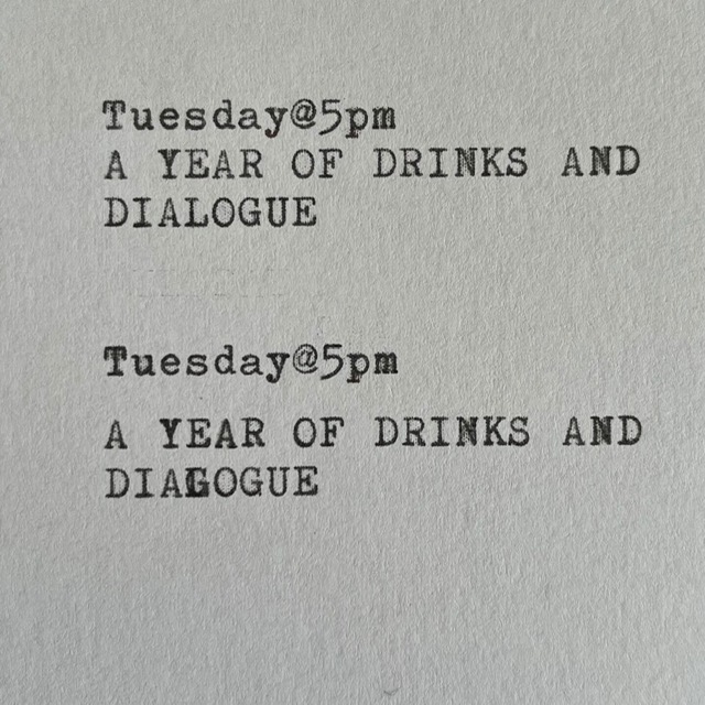
Project 2. Tuesday@5pm. After binding the ‘drink’ book, bellybands were constructed from the original endpapers of the 1940s Knitwear book which had inspired the project. This enabled both books to be contained as a pair.
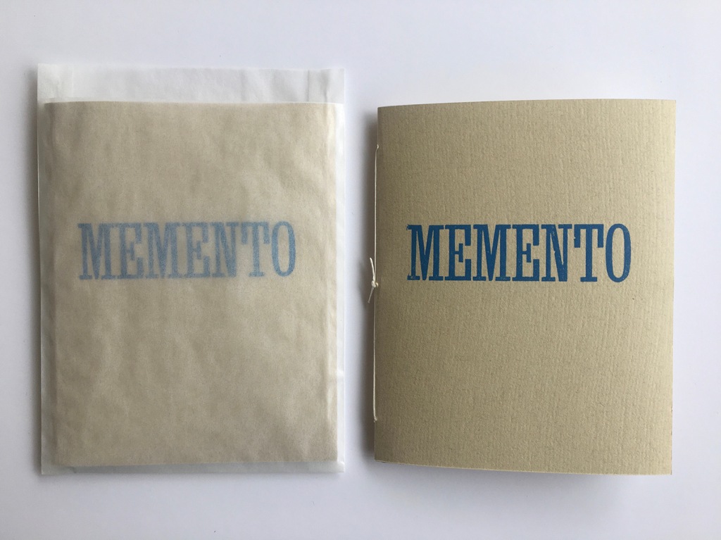
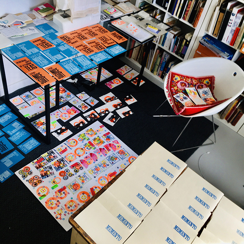
Project 3. Memento. Having received the remaining set of printed pages from T, the process of letterpress printing had to be repeated. It was noted during the making day that this process of making can be problematic as it results in the type having to be set and printed twice – which can be a time-consuming task. Once completed, typing was undertaken on the required pages, before cutting, collating and binding 16 books.
This prearranged meeting was to be an opportunity to work together on a series of current projects, to enable completion in time for the inaugural book and zine fair at Winchester on 15/16 March.
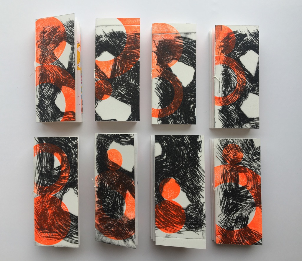
Project 1. Plot/Eight. Prior to the making day, discussions had taken place about a book completed in 2008 called Plot, the book had failed to sell, and the decision had been taken to reappropriate the book into a new edition. The day started by discussing the intended process, a critique as to why the book had been unsuccessful – suggested poor paper quality and a disparate colour palette. In addition to Plot was the recent discovery of a series of dry-point etchings by T (produced for Recovered/Recorded), which had been printed in reverse by mistake and therefore rejected.
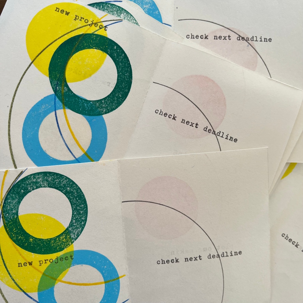
Connections were made by reviewing old blog posts in relation to both these works and a series of key words emerged: rotate-alternate-fragment-eight. This offered a starting point for reworking the book.
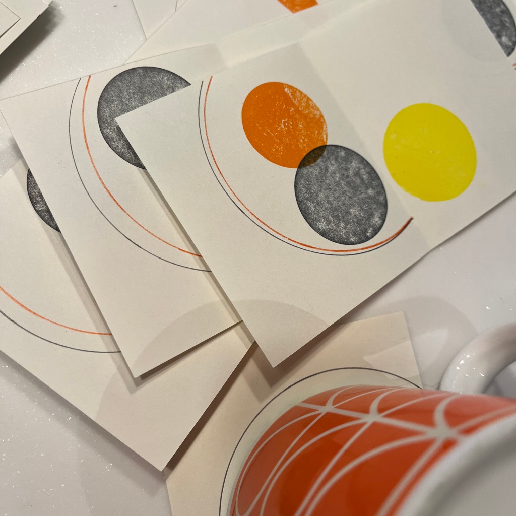
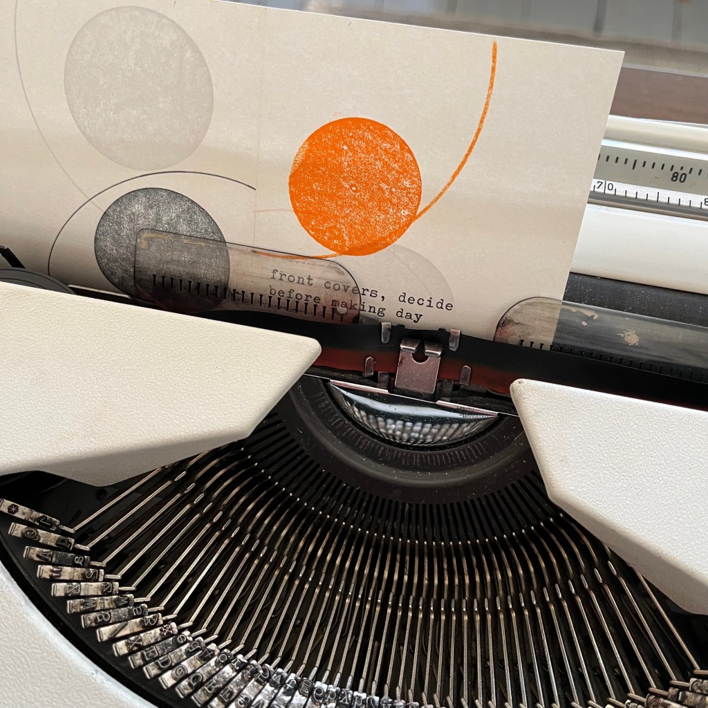
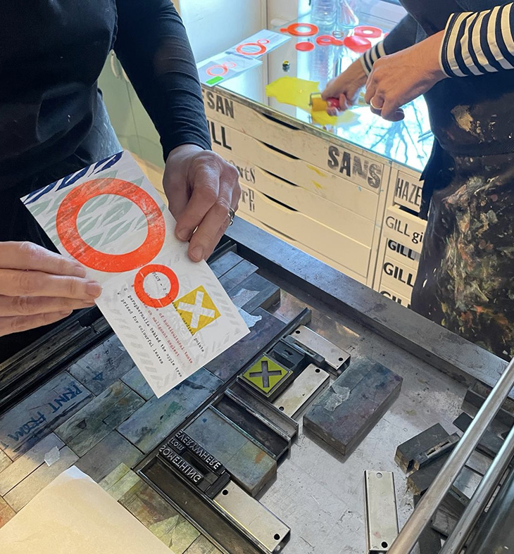
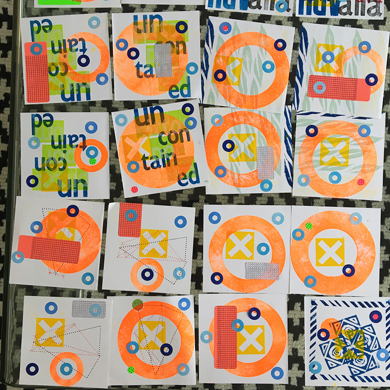
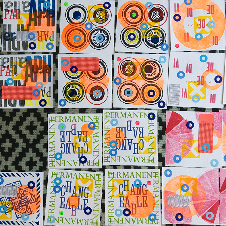
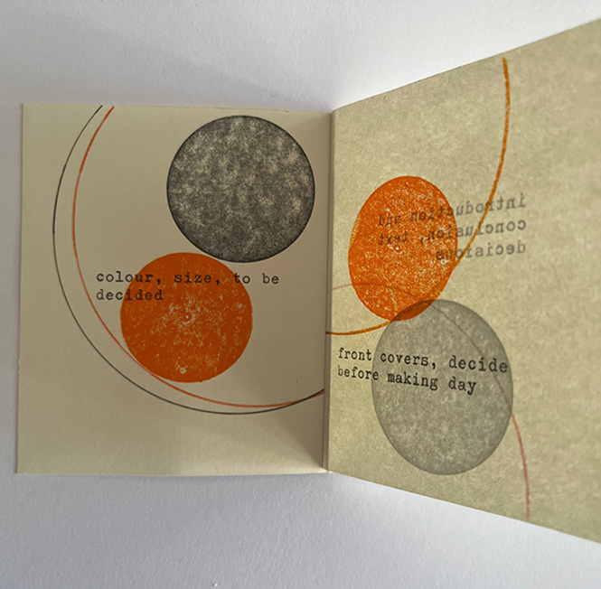
The etchings would form the new front cover; working with a singular ink colour (fluorescent orange) to offer consistency and tie the work together, we used a process undertaken for Recollections, whereby a series of different sized circles were inked and then randomly paired and over-printed onto the etchings, thereby representing an abstract form of a figure 8.
The Plot pages were disassembled and a series of four processes applied – two printed orange circles to imitate the covers, an X shaped letterpress block, typed pattern labels of four different shapes and colours, and four tones of blue ‘polo’ stickers offered variation and transformation. Finally working together, the a title page was letterpress printed onto a newly formed concertina structure.
Project 2. Tuesday@5pm. This was an opportunity to see both books together as they had previously been exchanged to enable individual elements to be added. The books were completed by the final addition of T’s printed knitwear stickers, and the collation and binding of the drinks book. The books were paired and the process concluded by the production of a bellyband made from the original endpapers of the book owned by T.
Project 3. Memento. Limited time on day two meant that decisions were made quickly in relation to the paper stock and typeface for the cover. Working together, type was set, ink mixed and printing completed. Further decisions were made in relation to page 12 and an alphabetical list of objects was edited and collated. The overprinting by T (see previous post) has enabled half the pages to be completed; it just remains for P to add type to the newly received image-based pages; when analysing this process of working, it was evident that working with letterpress, and setting up the press with type for each page twice, is time consuming, and future projects should take this into consideration.
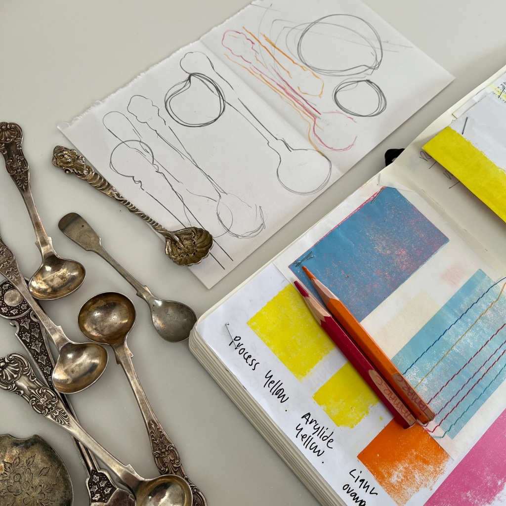
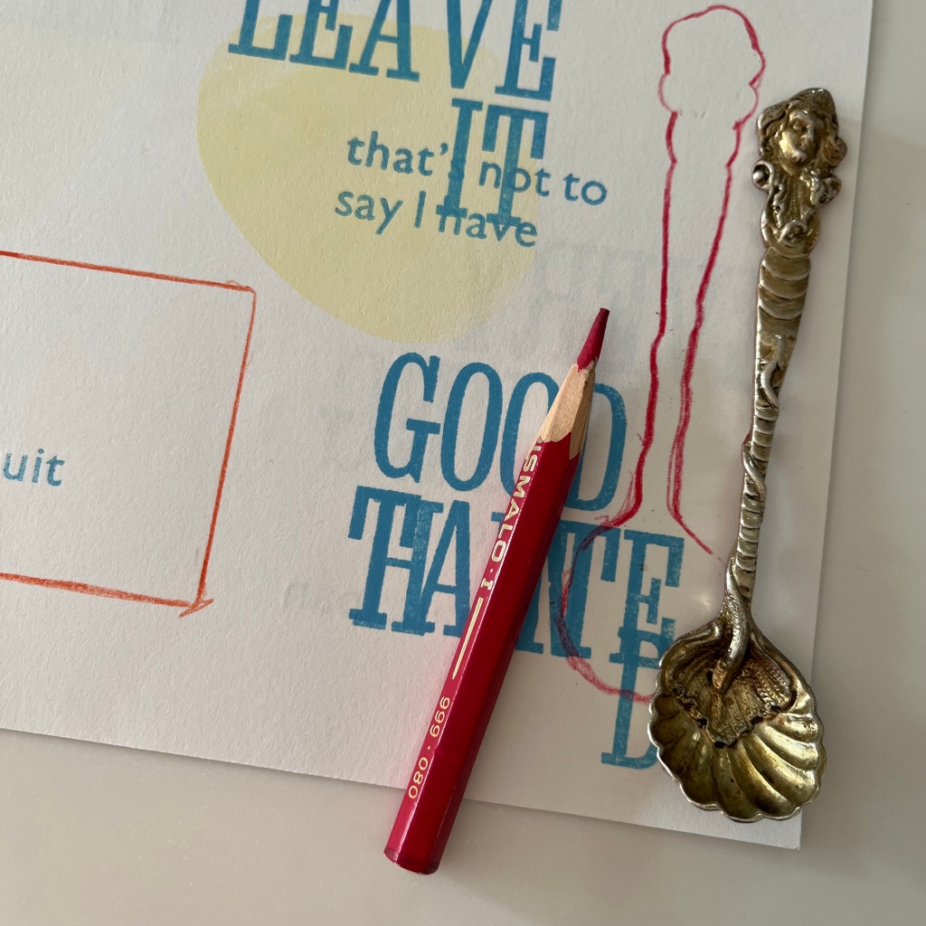

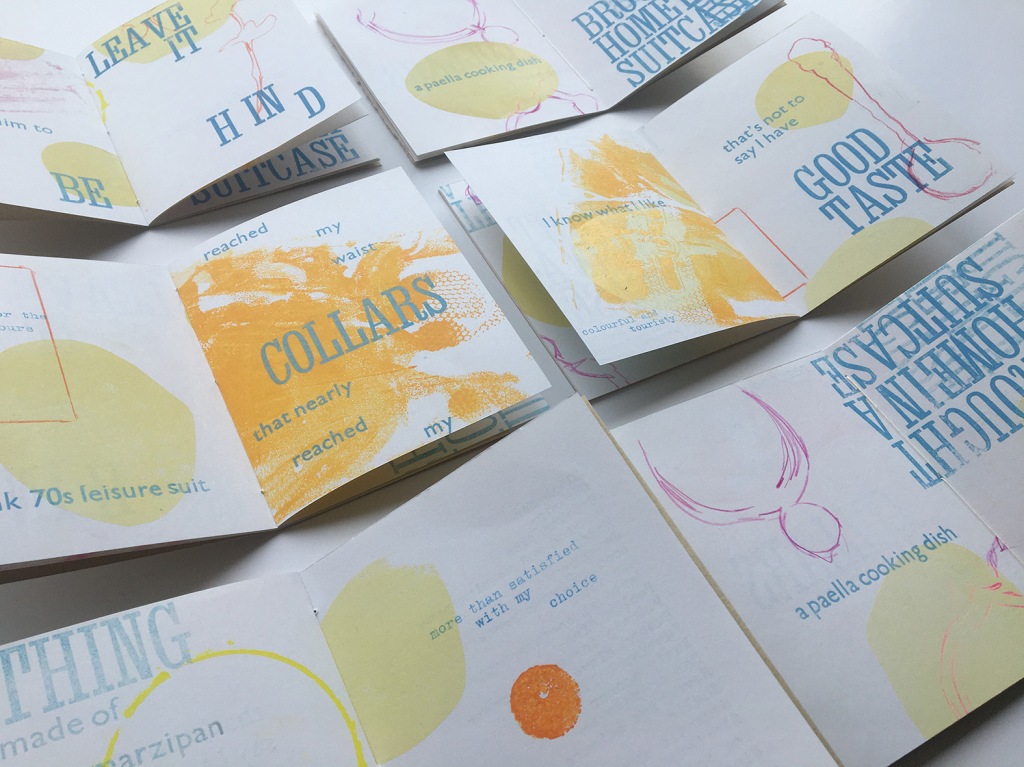
T: Having received the pages from P, I began by returning to the given list of holiday keepsakes to select which to represent. Noting multiple and single items began to suggest a visual approach and I determined to trace around objects collected in multiples and make a single print with individually found objects. With a nod to the colour palette from round trip, I tested a range of colours and objects exploring alternative placements in response to the printed pages received from P. I looked for connections and spaces to inform the final positioning, enjoying the opportunity to work with the text and extend given stories with the suggestion of other objects.
Having added the second layer of images to the text sheets, I added similar traced lines and printed shapes to the blank pages to share with P for the final printing. Having enjoyed working in response to the text, to connect, overlap and embellish each page, I found this section much more challenging and as a result was more cautious with the use of the page.
P: Working with printed pages received from T, the process of overprinting text began by selecting a range of short phrases from the gathered stories; the initial proposal was to ignore the book’s imposition to enable the type to appear at random places throughout the pages (as with Recollections), after further consideration it became clear that the narrative would become lost, therefore the idea was reconsidered to allow the stories to be read in a more logical manner. Tests were carried out using a range of typefaces, however the relatively small scale of the book meant that choice was limited, and the decision was made to work with two fonts, using a single colour from the pre-determined colour palette. Once printing began, decisions were made swiftly, often using WhatsApp messages to discuss and confirm details. There were some reservations about the type dominating specific pages, however, like the process for Kitchenalia, this can be adjusted when in receipt of the image-based sections from T. The final part of the process was to discuss and confirm the title and sub-title of the book to enable all pages to be completed before returning to T to add the image-based element.
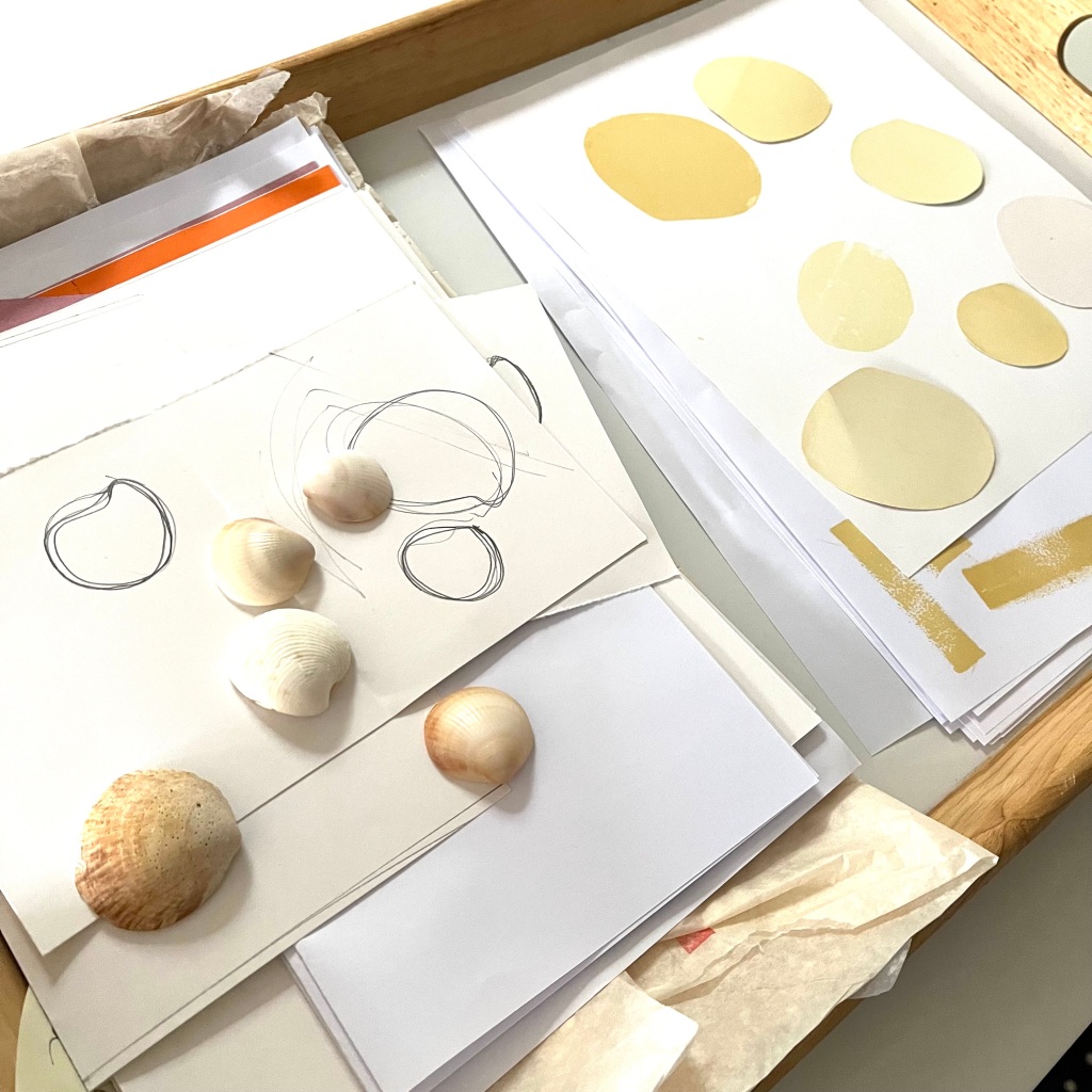
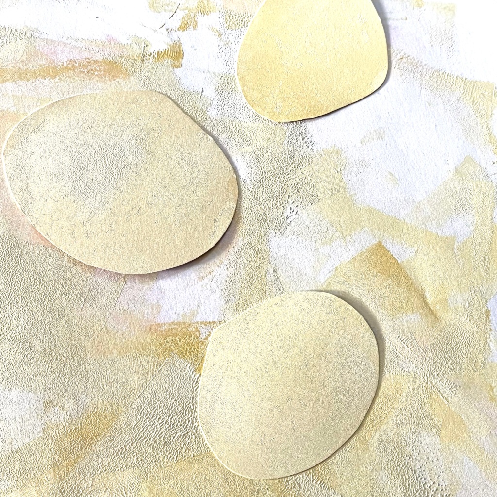

T: Taking inspiration from the outline and colour palette of found shells, I cut shapes and printed these onto the front and back of the large sheets of paper to complete the first image-based task. Placement is purposefully irregular to offer varying compositions throughout the final edition of books.
With a return to the working methodology of Kitchenalia, half the pages were posted to P to add the text-based task and return to me to add the final image task, and the other half were retained for the final image task to be completed before sharing with P to add text. This sequential working process may require some amendments with scale, colour and placement offering alternative approaches to the same data.
To conclude Tuesday@5pm a series of discussions took place in relation to book title, sub-title, front cover and key. Ideas were trialled and images sent back and forth via WhatsApp, until agreeing and finalising at a weekly online meeting.
Having gathered limited data at Small Publishers Fair for a book proposal based on Souvenirs, further stories were gathered via email and conversations with family and friends. This information was plotted onto a spreadsheet to enable potential connections to be highlighted; the form and format was led by two factors: a donation of a bundle of 5 x 4” glassine envelopes and a desire to return to a process of working adopted for Recollections, whereby work is undertaken on large sheets then cut-up to form the imposed pages. Dummies were made and reviewed enabling decisions around content, form and methodology. The process will be formed of three tasks, two image-based (TM) and one text-based (PW) – a return to previous practice, with printed pages developed and exchanged at different stages to inform a range of unique pieces.
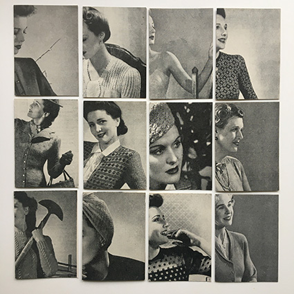

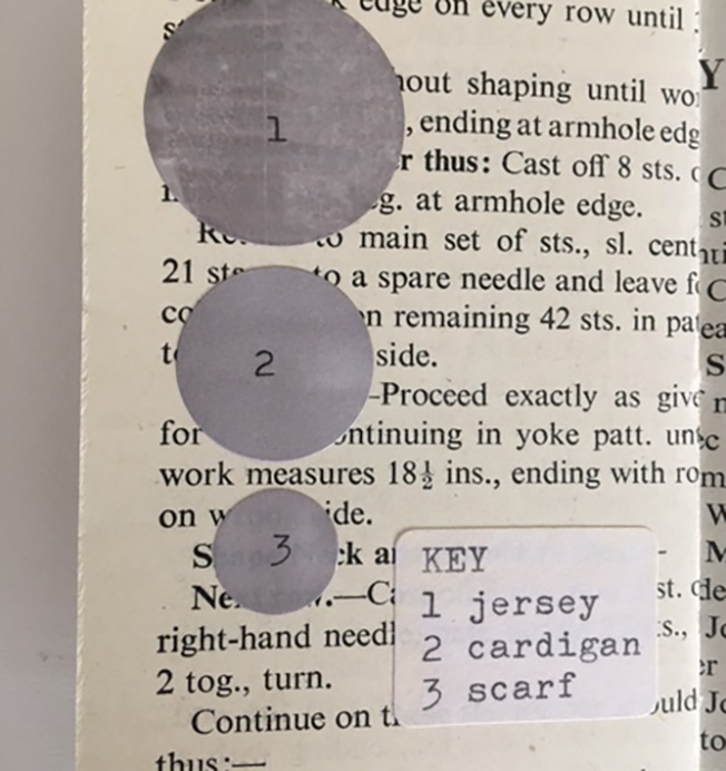
Book 1: The pictorial pages from the original knit book were cropped and trimmed to form a series of front and back covers; discussions took place around adding some form of colour to the front as a contrast with the remainder of the book, stickers or a printed shape will be tested and considered.
Book 2: Vintage magazines from the late 50s were the source of a range of drink advertisements, using black and white samples only, these were also cropped and trimmed to form covers to complement book 1.
P: Having sourced a range of different sized stickers to represent different garments worn, and using the hand-knit sample supplied by T, the knit was inked in the necessary colour and printed on the relevant sized sticker. A decision was made to use a finer piece of machine knit for the smallest sticker due to concerns regarding scale, although earlier tests and not been particularly successful, the end results were surprisingly positive.
T: Working to a pre-determined colour key, drinks enjoyed by each of us within the relevant 10 days were represented using previously explored processes (mono printing and tracing objects of use). Typed fragments of conversation topics were added to each page with the composition determined by first shapes printed. This offered the opportunity to connect / overlap shapes and words suggesting an evolving discussion.